
Coffee Nook
A Cozy Cafe Table Booking Experience
Coffee Nook is a mobile application designed to simplify the process of booking tables at cafes.
My role: Lead UX Designer
Project duration: 3 weeks
Tools: Figma & Plugins, Adobe Suite
Year: 2025
The Problem
Users who often work or study from cafes struggle to find available and comfortable seating, especially during busy hours.
User Research
I conducted a series of user interviews and online researches to better understand how people choose and visit cafes.
-
My initial assumption was that most users were primarily interested in discovering new cafés.
However, research revealed that users were more concerned about availability and convenience. Many struggled to find open tables or quiet spots to work or meet friends.
These insights shifted the project’s focus toward creating a simple and reliable table-booking experience rather than a cafe discovery platform.
Pain points
Uncertain availability
Users can’t easily know if a café has open tables before arriving.
Finding a suitable seat with specific needs (like power outlets or quiet areas) is difficult.
Inconsistent comfort
Lack of planning tools
Users have no simple way to book or organize their cafe visits in advance.
User Personas
Robert
52 years old
Sidney, Australia
“These days, it’s so difficult to find a good spot to work at”
Goal: view and book a table at a cafe in advance.
Frustration: struggles to find reliable seating availability at local cafes.
-
Robert is a small business owner who often works from cafes who needs a reliable way to find and reserve a comfortable table in advance because he frequently struggles to find available seating with power outlets and a quiet environment to work productively.
Erika
22 years old
Seoul, Korea
“I hate to find myself wandering between cafes looking for a power outlet”
Goal: secure a guaranteed workspace by booking amenity-specific seating in advance.
Frustration: often finds herself cafe-hopping, struggling find seating with the needed amenities.
-
Erika is a student who needs to be able to secure a guaranteed workspace with amenity-specific seating because she frequently wastes valuable time searching for one.
Starting the Design
Paper wireframes
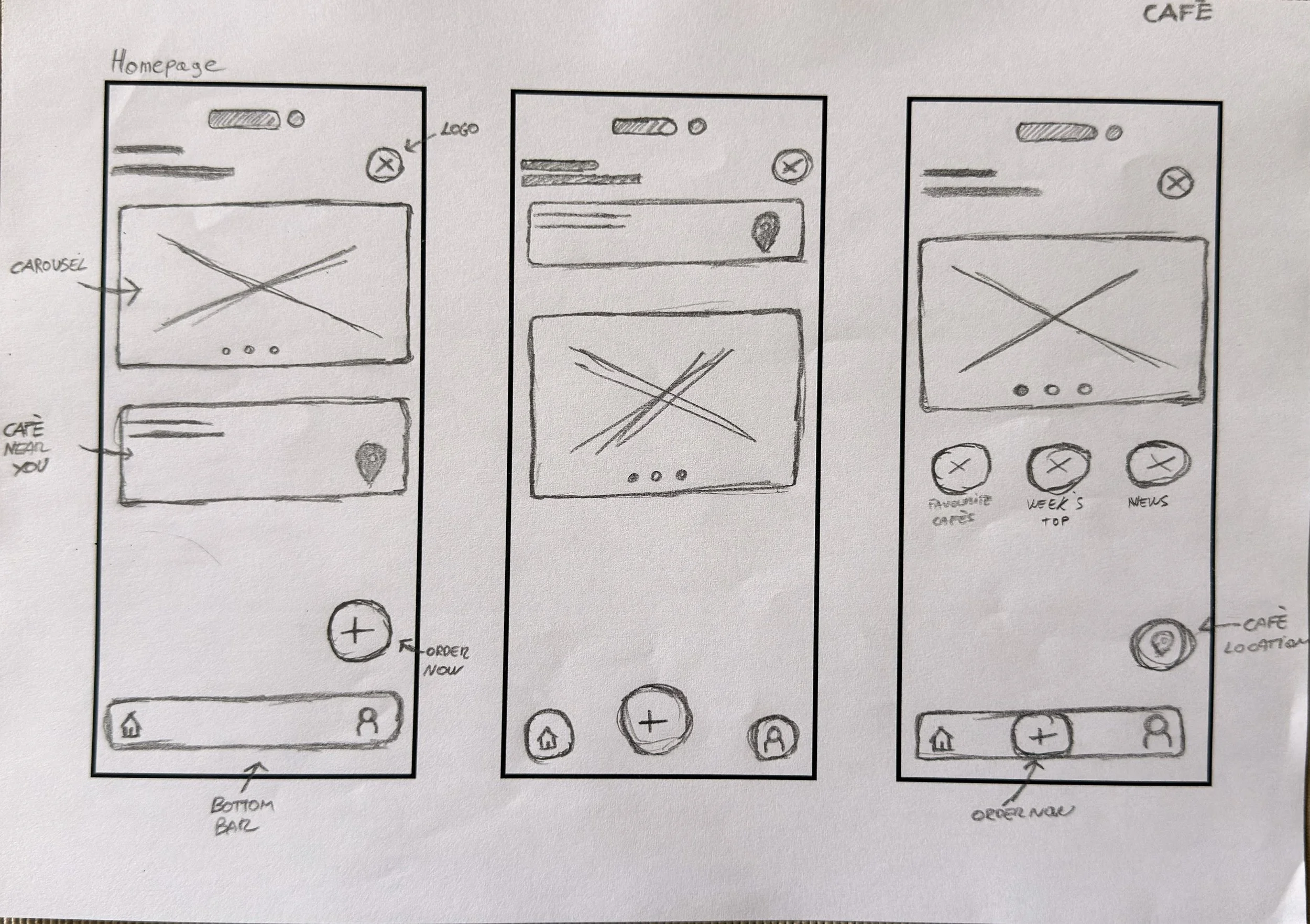
Final Screen
-
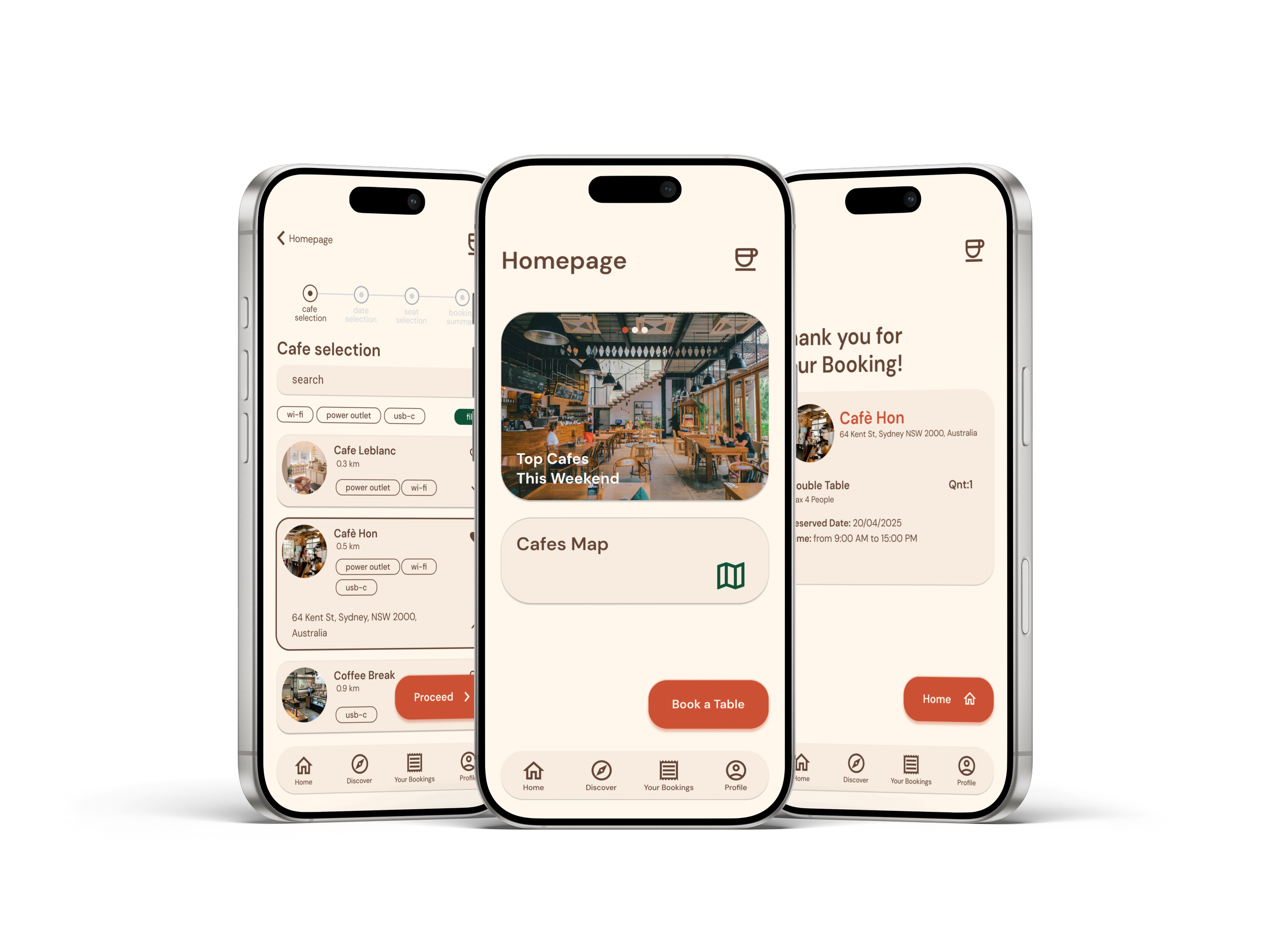
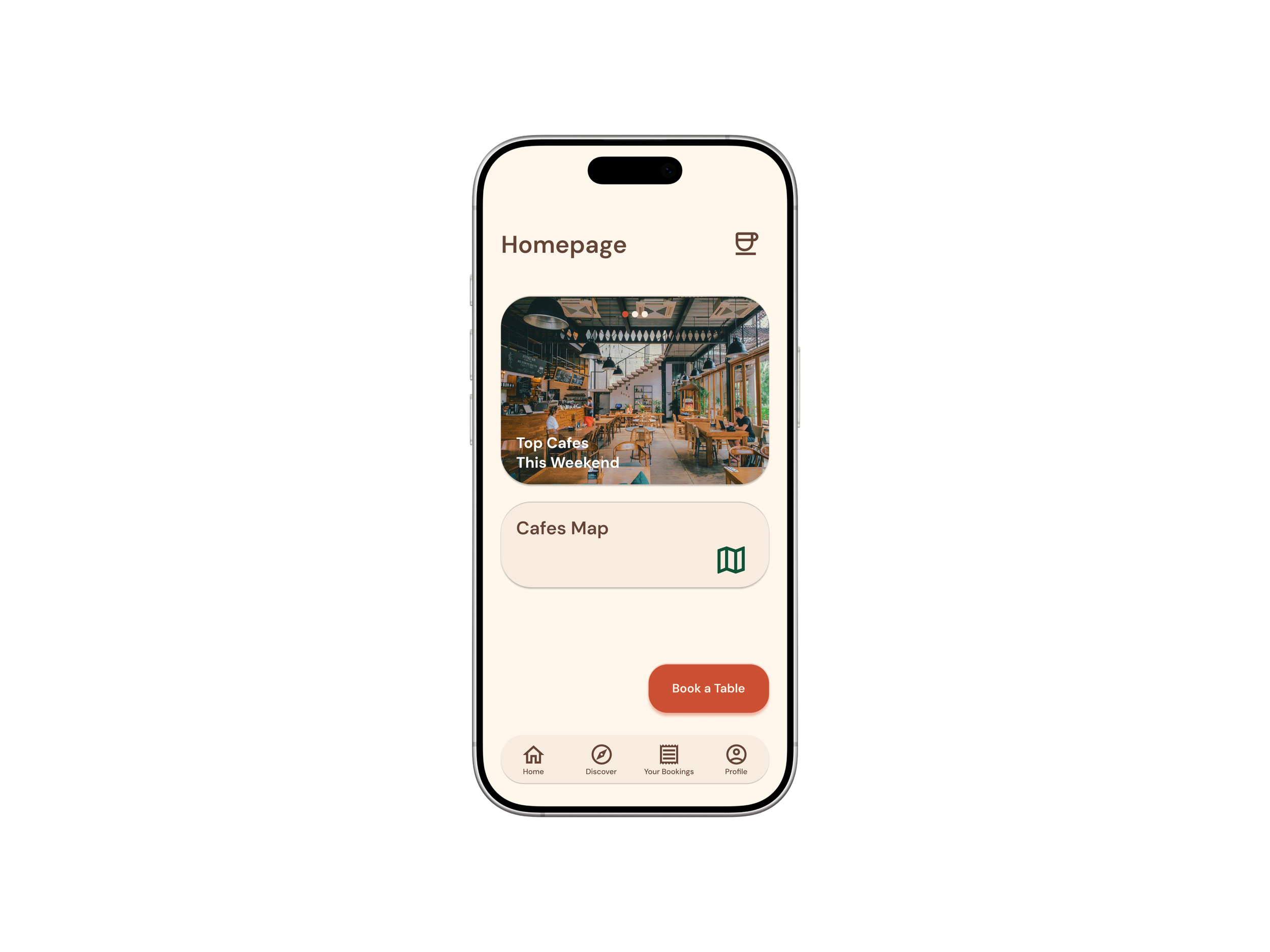
The goal was to design a simple and welcoming homepage that helps users quickly find nearby cafes or book a table. I focused on creating a clean layout with clear navigation and avoid clutter.
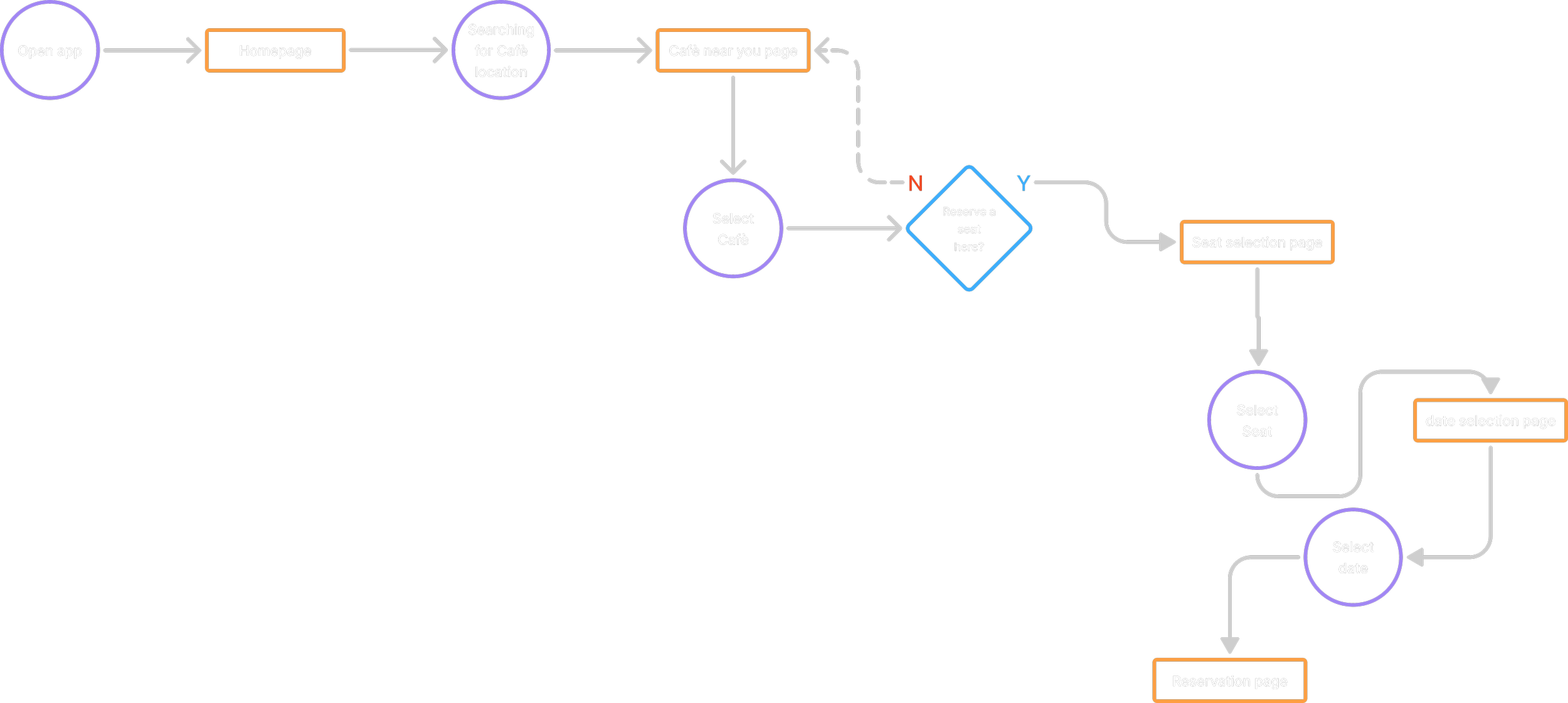
User Flow
Digital Wireframes
-
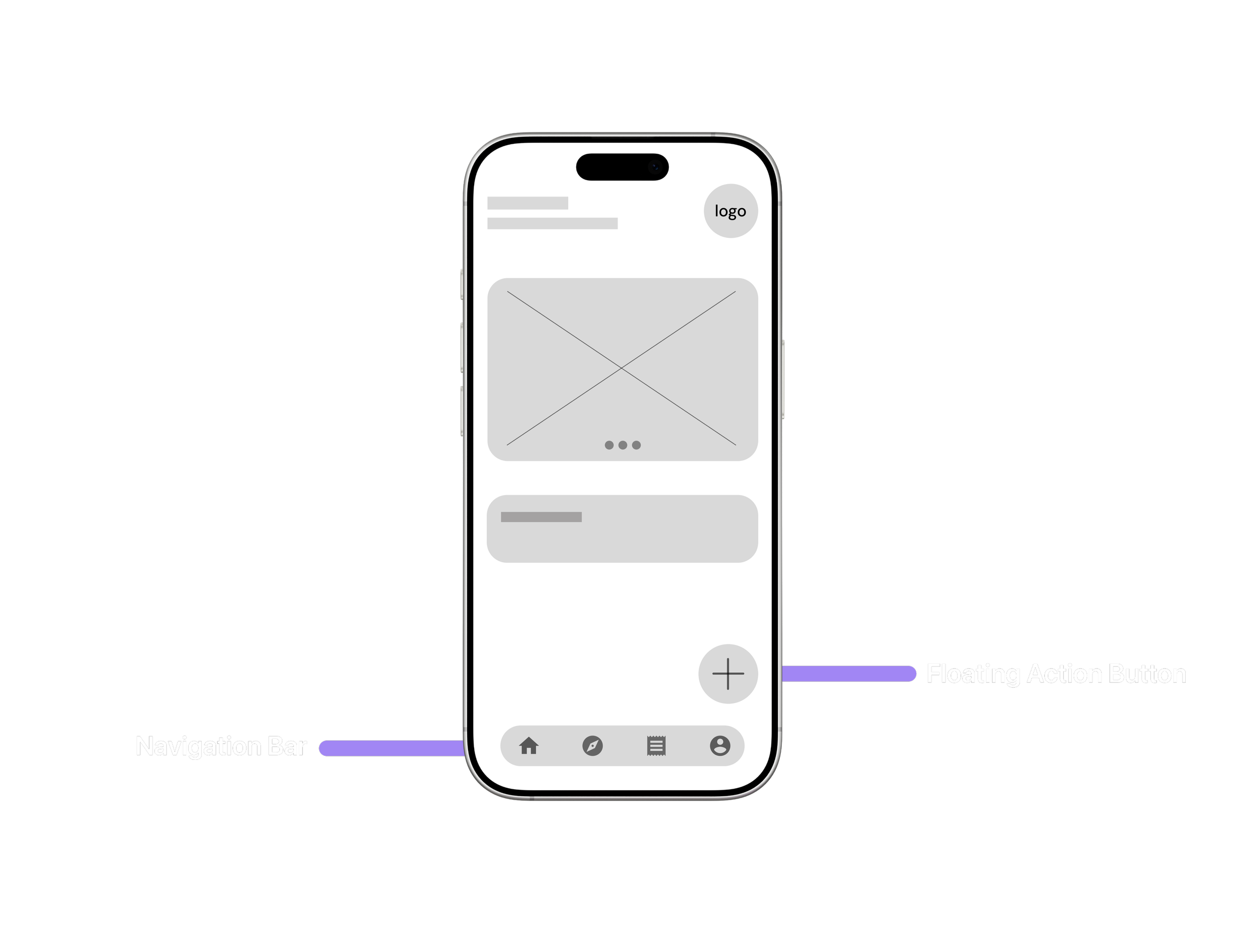
The layout was designed to make key actions easily accessible through a fixed navigation bar and a floating action button. This structure improves usability by allowing users to reach main functions quickly while keeping the interface clean and intuitive.
-
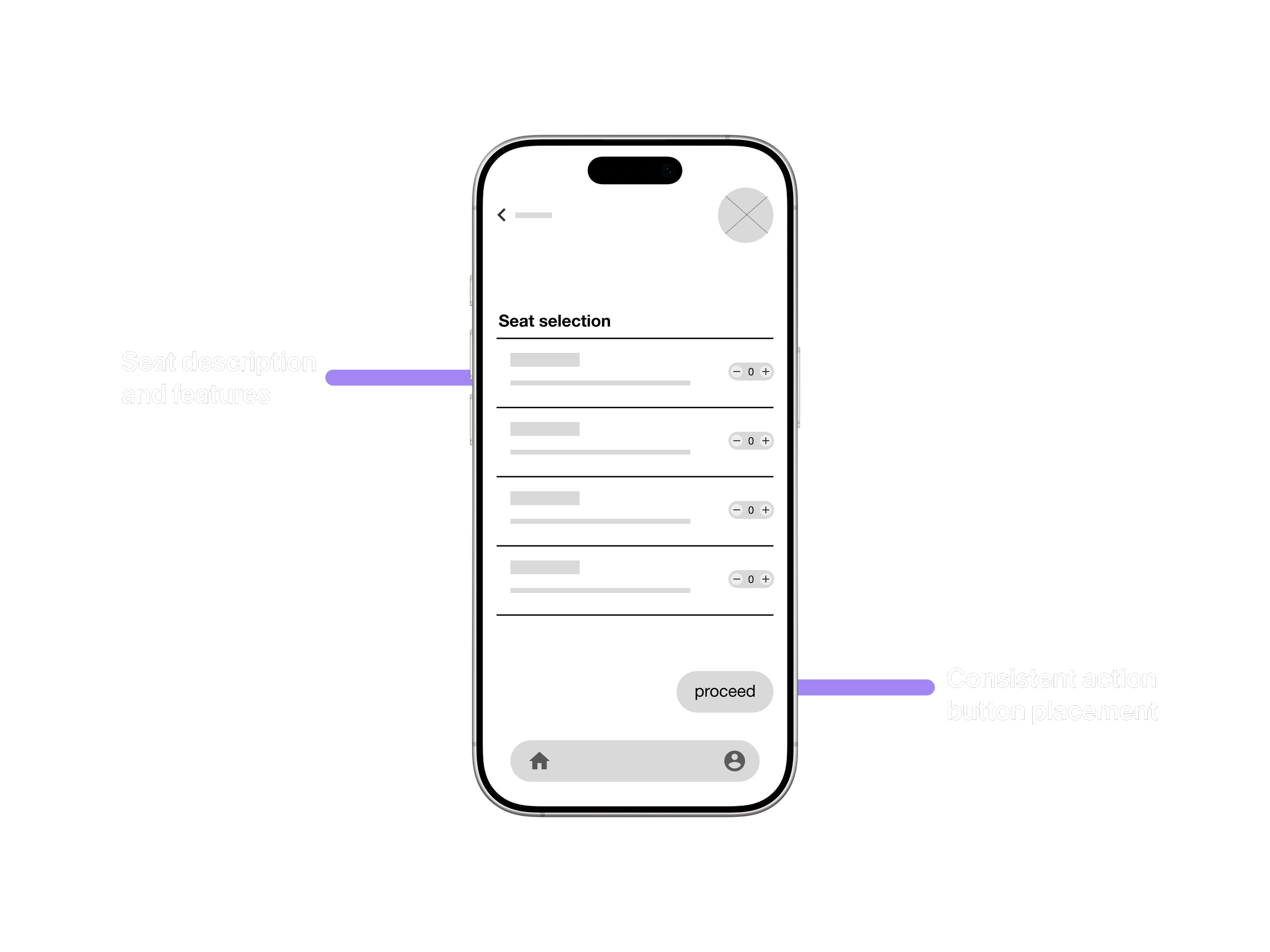
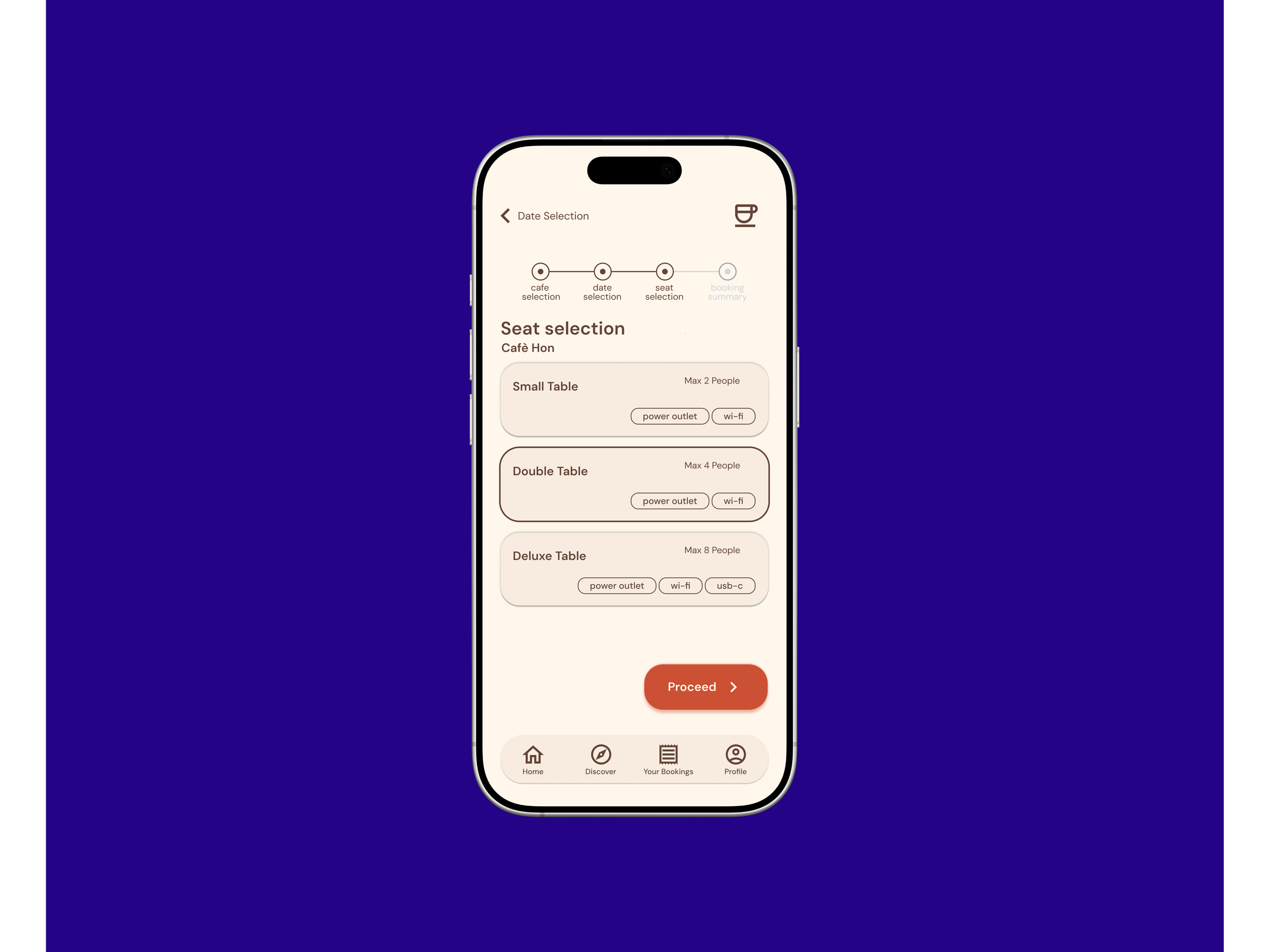
The seat selection page was designed to give users a clear overview of available options and make the booking process straightforward. The goal was to minimize confusion by using simple labels, consistent button placement, and clear visual hierarchy for different seat types.
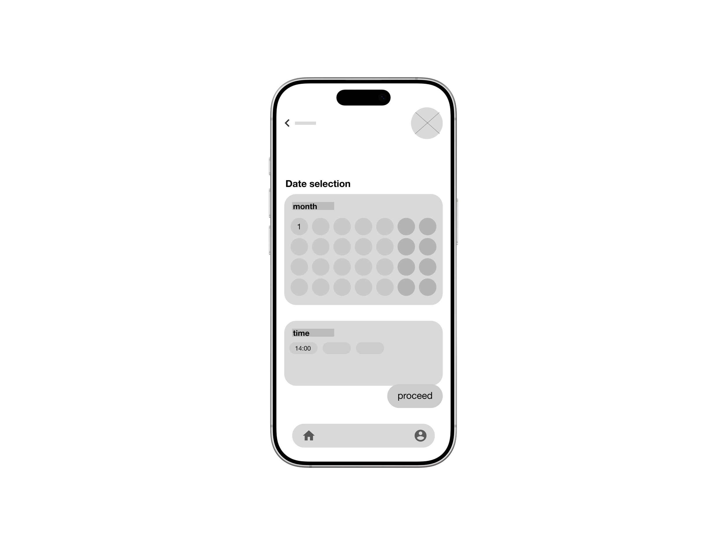
Date Selection
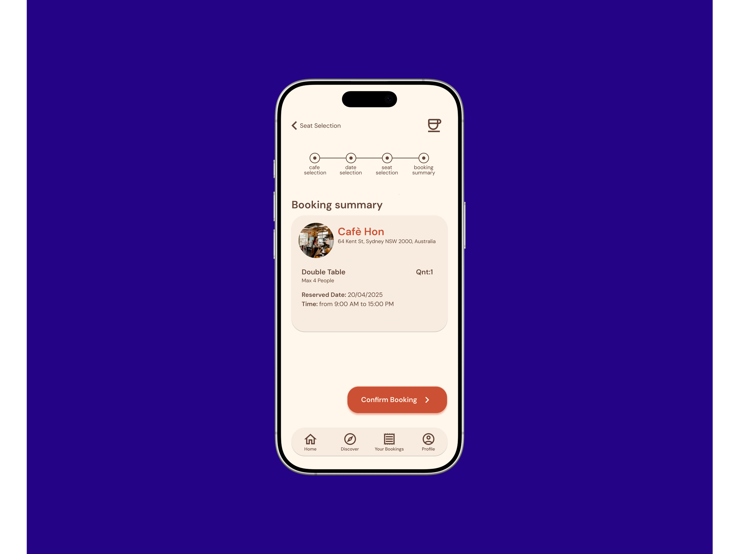
Booking Summary
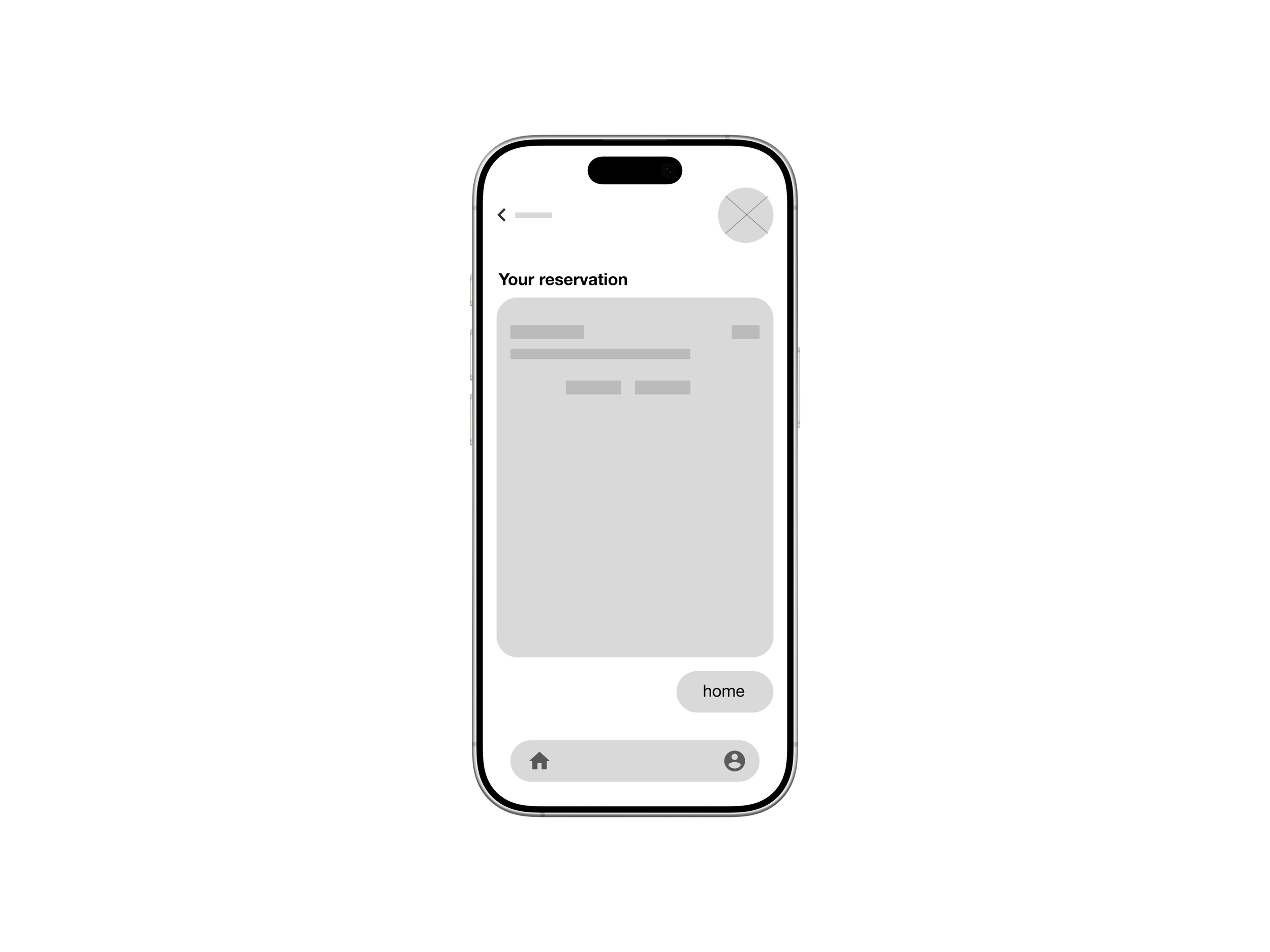
Reservation Page
To evaluate the booking flow of the cafe app, I conducted a usability test with participants representing our target users. The goal was to observe how easily users could complete a table booking and identify any friction points in the process. Based on the findings, I moved into the first iteration phase to refine the booking flow.
Usability study
-
Users reported feeling disoriented during the booking process, suggesting that a clearer progress indicator would significantly improve the experience.
In response to this result, I implemented a progress stepper to help users orient themselves throughout the process.
-
Users reported feeling disoriented during the booking process, suggesting that a clearer progress indicator would significantly improve the experience.
In response to this result, I implemented a progress stepper to help users orient themselves throughout the process.


before
after
-
Usability testing revealed a mental model mismatch: users expected to select a date and time before choosing a specific seat, leading to confusion during the booking flow.
In response, I reordered the task flow to prioritize date selection, ensuring a more intuitive and logical booking experience.
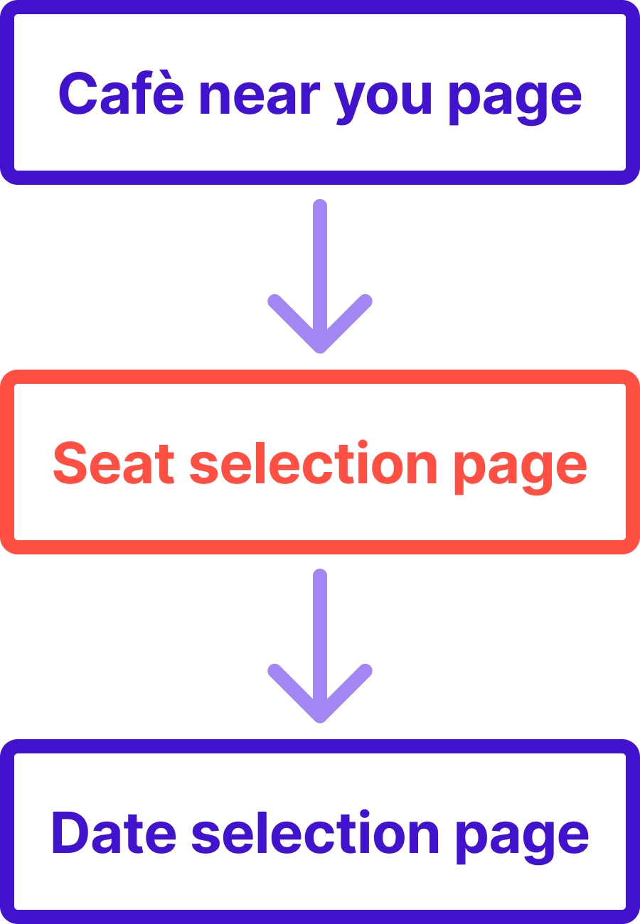
before
after

Refining the Design
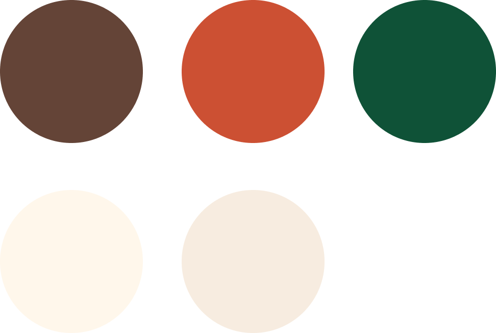
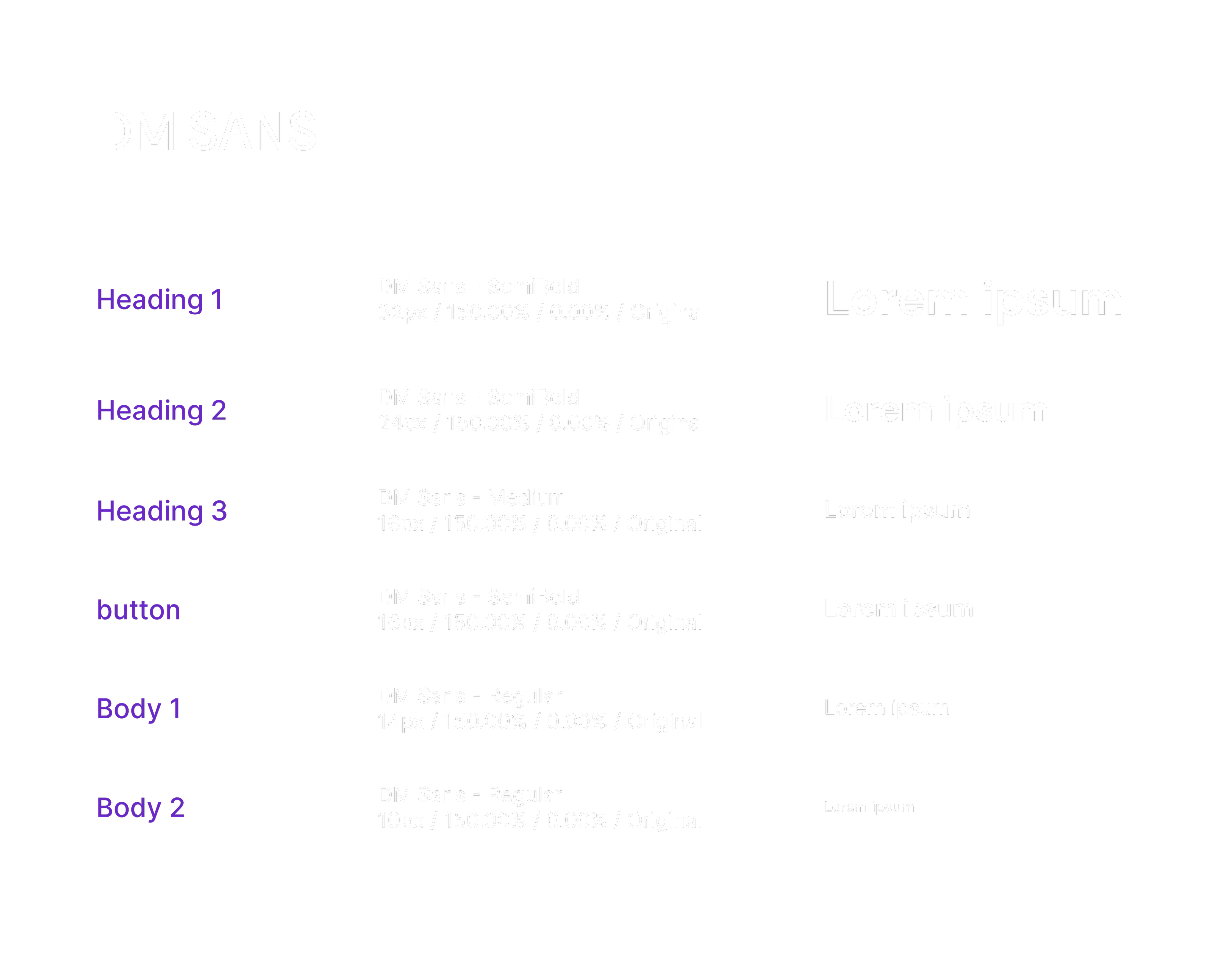
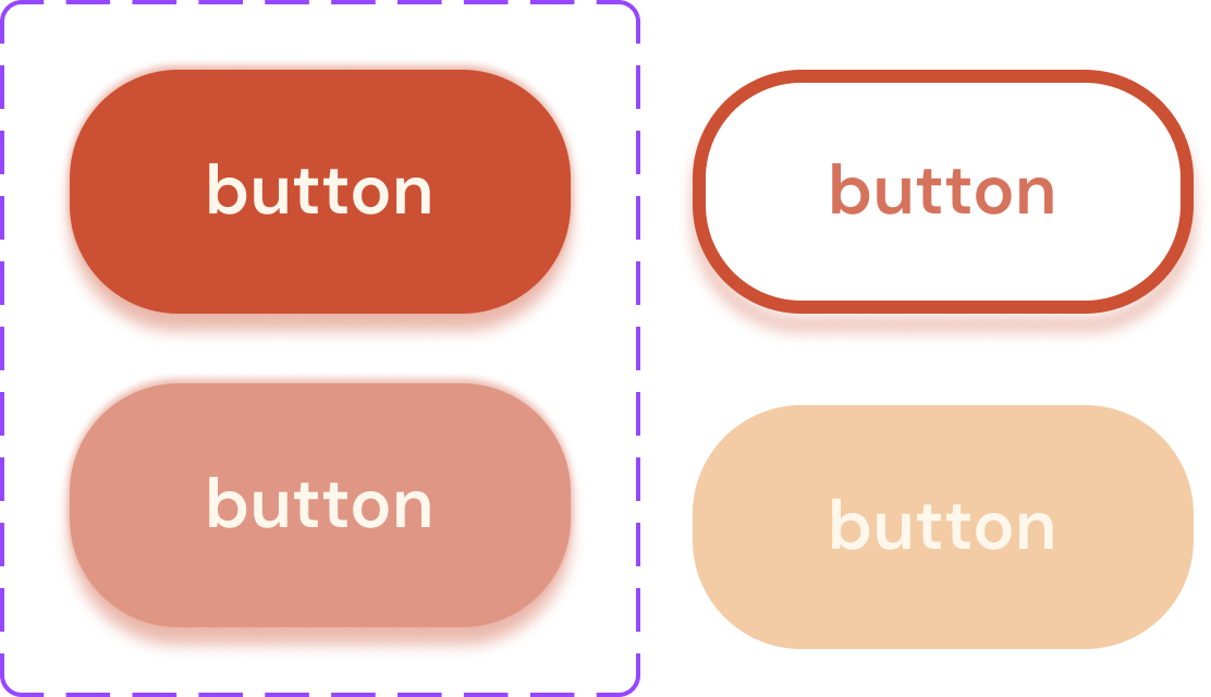
After refining the wireframes, I transitioned into high-fidelity design by defining a cohesive visual identity. This phase focused on building a scalable design system that balances aesthetics with WCAG accessibility standards.
Visual Identity
-
The visual identity centers on a warm, earth-toned palette designed to evoke the cozy, inviting atmosphere of a local café. I chose DM Sans as the primary typeface for its exceptional legibility and neutral, geometric profile, ensuring that complex information remains clear and easy to navigate.
Mockups
-
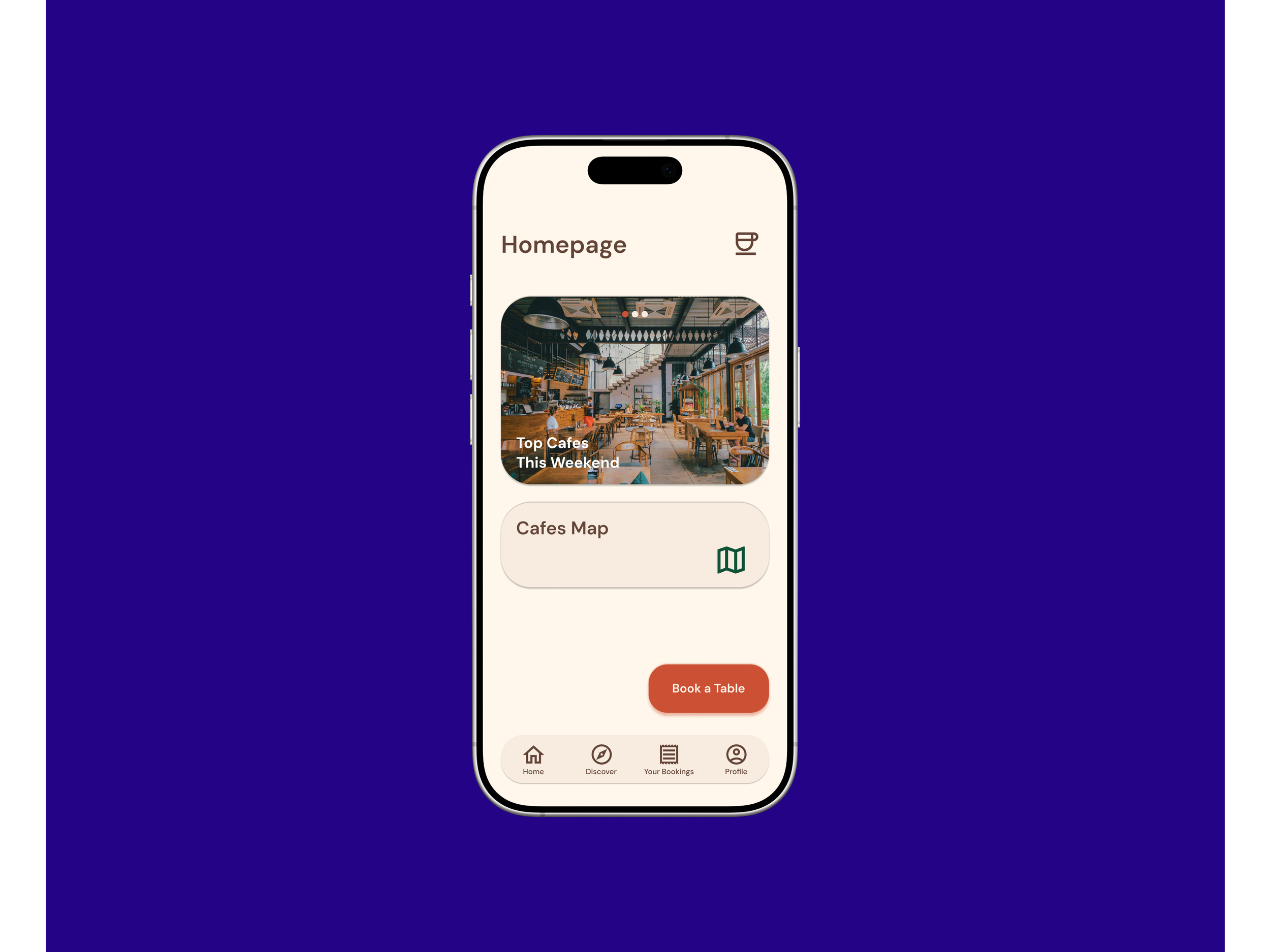
![]()
The Homepage
-
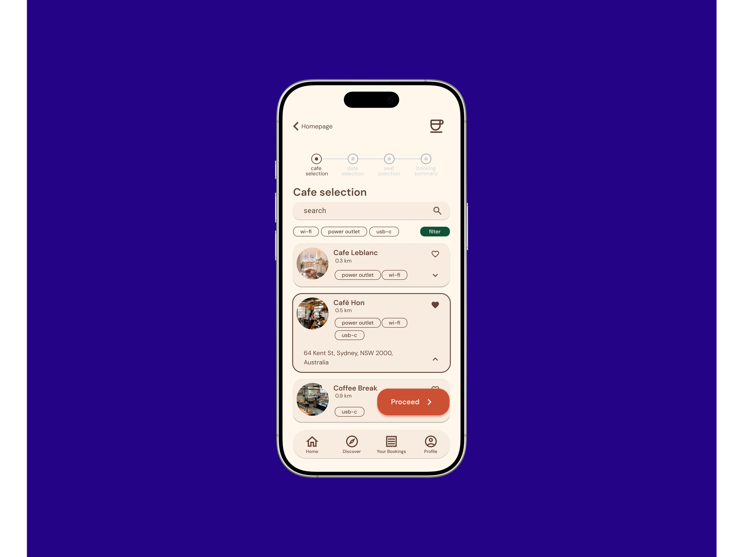
![]()
The Cafe Selection
-
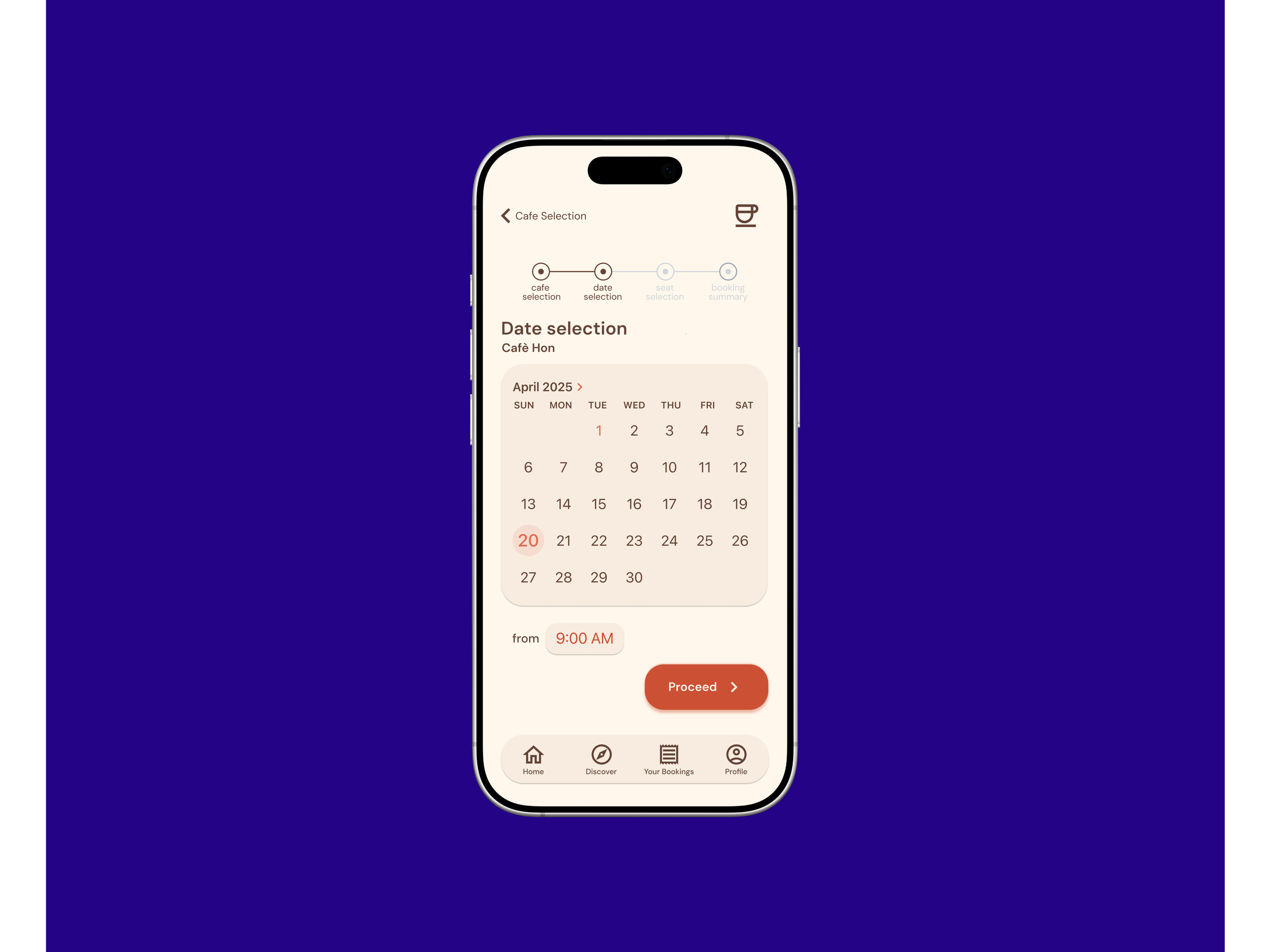
![]()
The Date Selection
-
![]()
The Seat Selection
-
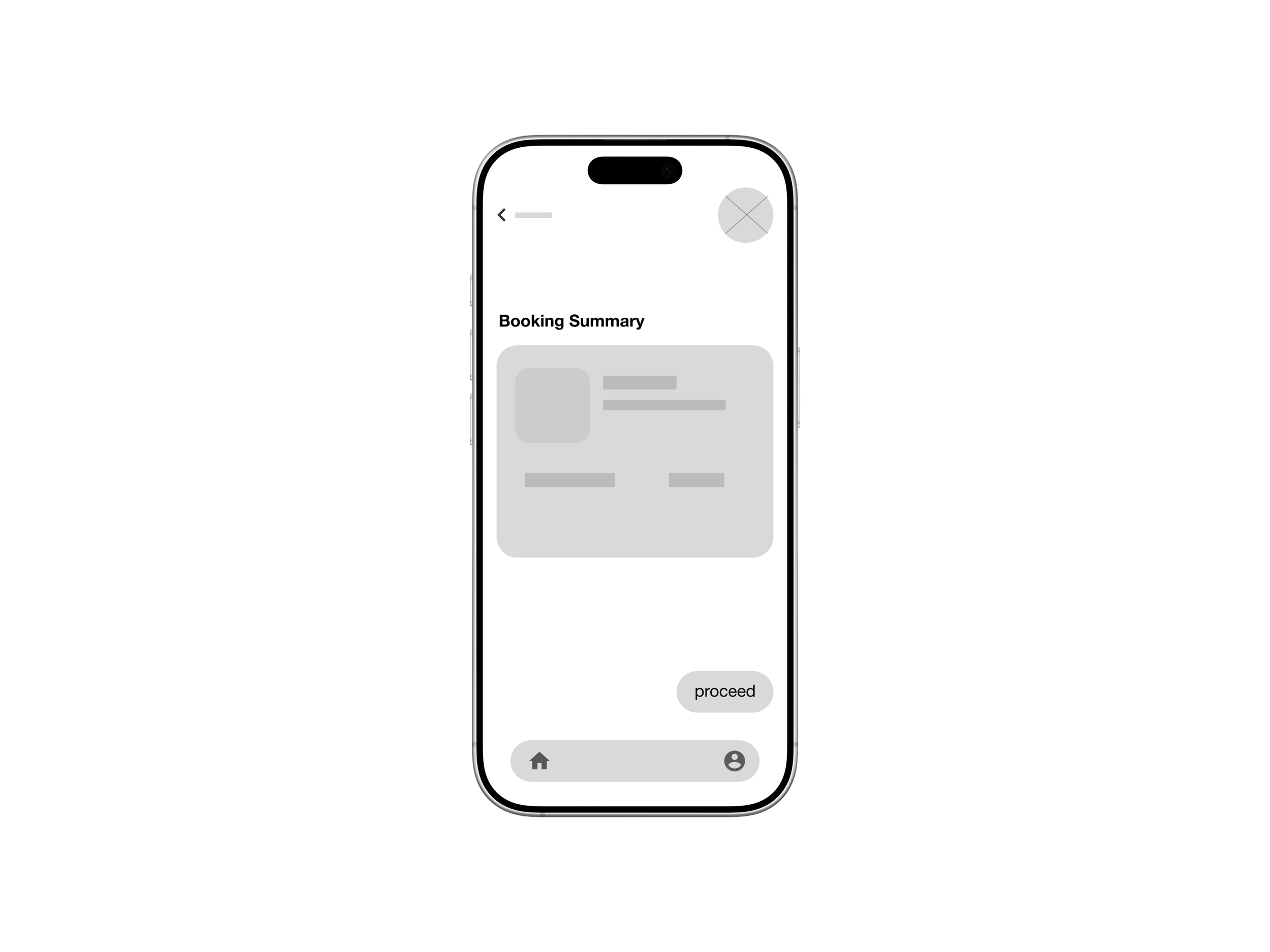
![Booking Summary]()
The Booking Summary
-
![]()
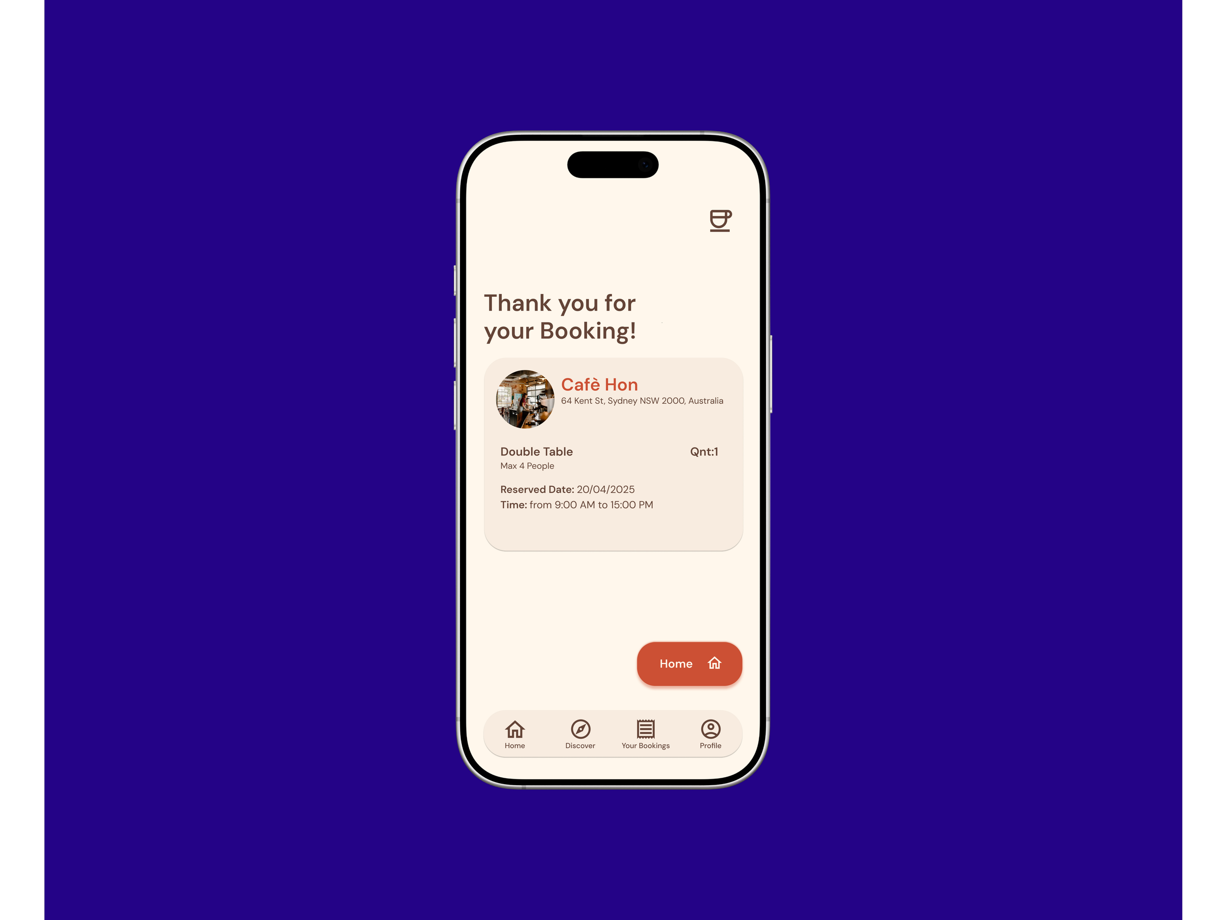
The Booking Confirmation
-
![]()
The Error Page

Click the button if you want to try my prototype!
Accessibility
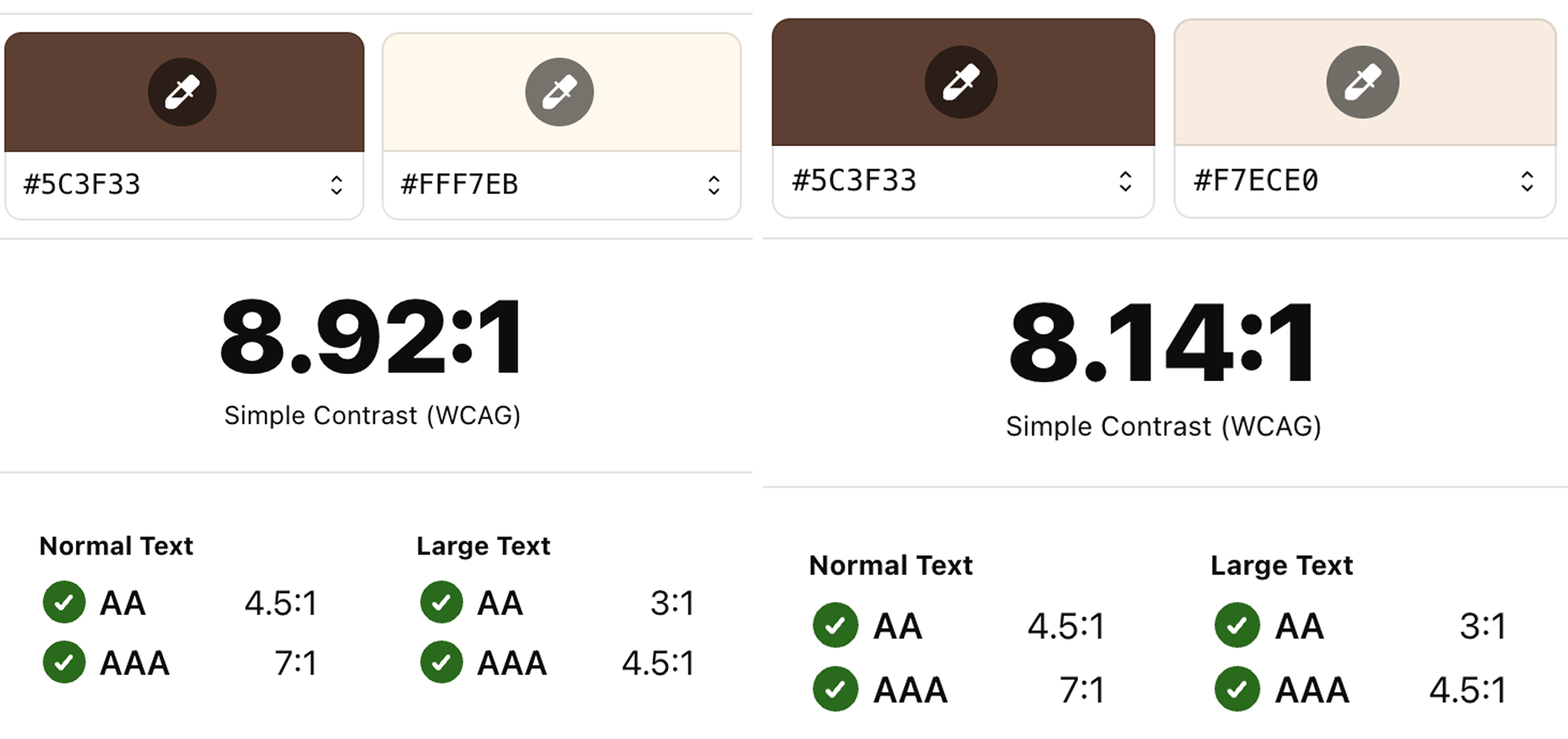
Contrast Ratio
I ensured all text and interface elements met sufficient contrast ratios to support readability for users with visual impairments.
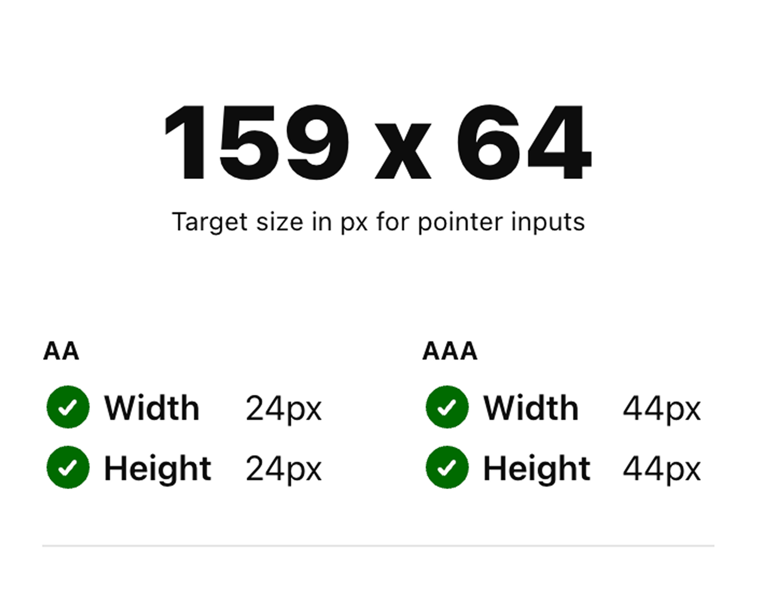
Button Size
In alignment with WCAG guidelines, I ensured all interactive elements have a minimum touch target size of 44x44 pixels.
Takeaways
Impact
The updated booking flow made the app easier to navigate, with one participant noting, “I really like seeing the steps and reviewing my booking. It makes everything feel clear and simple.”
What I’ve learned
Through this project, I moved from 'designing for myself' to designing for the user. I learned to embrace the iteration phase as a tool for discovery and refinement. By focusing on WCAG accessibility standards, I created an interface that is both beautiful and functional. I’ve realized that a strong UX foundation is the most critical element of any successful product.